Cannabis products are hitting the market as legalization sweeps the nation, growing in acceptance and popularity each year. With this comes competition, and in a space that started out with very little of it, branding your cannabis products correctly is crucial to your business’ success and profitability.

One of the mistakes that cannabis companies make is thinking that they need to create unique strategies for their packaging just because cannabis is such a unique market. But while there is an audience to target and factors that you need to consider, typical consumer behaviors are very much still applicable and more important.
We’ve put this blog together to help cannabis production companies better understand and build their packaging strategies. We consider the behaviors of this niche audience while still implementing traditional strategies that are tried and true in the packaging space.
Understanding the Shelf Impact
Every product, no matter what it is or who’s buying it, needs to stand out on the shelf—or your brand goes up in smoke. Your product’s packaging needs to be more than visually appealing: It needs to interact with all of your customer’s senses.

Depending on the individual store where your product is sold, you may need to make adjustments. Are the shelves high up, making your brand harder to spot among the others in stock? Most dispensaries keep products locked and only available to touch once a customer asks for assistance, which is important to note when creating your packaging. For cannabis products, the customer must be mostly sold on the product before they can even touch it. This means visuals play a huge role in selling the product—but don’t forget that your customers will eventually hold it and take it home.
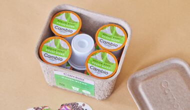
Appealing to the Senses
To piggyback on what we discussed above, let’s go into how things play out once your packaging is in the customer’s hand. The shape, color, and text on your packaging are all crucial to getting that sale.

Let’s start with shape. And to clarify, by shape, we don’t mean that a specific shape works for cannabis products—we mean that the shape of your packaging needs to speak to your brand. If your brand is named after a natural landmark or landscape, you’d need the shape of your packaging to mimic that. It’s simple enough, but this can be tricky when it comes to uniquely shaped products that need sturdy, protective boxes. The shape should feel comfortable to hold and entice customers to not only purchase it but also possibly save it, which is a great way to improve brand awareness outside of your dispensary.
The color of your packaging can make or break a customer’s brand recall. Your packaging colors need to match your brand colors—no question there. A customer may visit a dispensary and simply scan the shelves for that “robin blue box” they previously purchased, so it’s important that your other packaging resemble it in some fashion to re-engage these returning customers. Keep in mind that your colors don’t always need to be unique or flashy to attract customers—they just need to be unique to your brand.

What’s written on your box can also make or break a sale, especially once it’s in the customer’s hand. Maybe they care about environmental impact but you’ve made no mention of your sustainability efforts—back on the shelf it goes. Your customer may also want to know where your product is made and what quality control processes are used. While these are important, it’s also a balancing act. You want just enough text to answer your customer’s most burning questions and express your brand’s values—you’re not writing an essay trying to address every possible concern. Make sure you include important product details, too.
Be Authentic
Depending on how much time your brand has spent in this space, you may have some leeway here. But overall, it’s important to not stray too far from your brand’s image when it comes to packaging. If your brand boasts environmentally friendly packaging in pastel colors and simple text, your next product shouldn’t be in a clunky, giant, non-recyclable box with bold text. Obviously, changes can be made and differences should appear between products, but you don’t want to create too many packaging variations because doing so could distill your brand image to the point that it’s no longer recognizable.

You want to establish who you are as a brand and understand who your customers are. If you deviate from these, whether it be a new market or product space you’re entering, it can seem disingenuous to loyal customers of your brand. It’s important you find a way to showcase your brand’s vision and voice, even if it’s in a market that you feel your brand may not suit. You’d be surprised to see how much more important your brand’s authentic voice is over the desire to penetrate a new market. Consider our range of packaging solutions for small businesses, designed to align with your brand’s eco-friendly values.
A great example is Tiffany & Co, a well-known and entrenched jewelry brand. If they were to start selling cannabis products packaged in a color other than Tiffany blue, it would most likely not go over well with customers, especially ones that are loyal to the Tiffany brand and expect to see that classic look, even in a new market.

Getting Started
We covered some of the basics here to avoid overwhelming you, since you’ll often need to consider many other factors. Packaging is an entire market of its own, and understanding the nuances of cannabis packaging cannot be accomplished overnight. As the cannabis industry grows, so will the packaging strategies unique to this space. Luckily, cannabis package design has become one of our industries of expertise.

That’s why our packaging experts here at Zenpack are ready to assist you—we have experience in the cannabis packaging industry and understand the different aspects of the market that make the packaging strategy unique. Contact us to learn more about our services, from packaging concept to fulfillment, and start your next project today.
If you want to know more about Zenpack’s services
Let our packaging consultants help you turn your idea into reality.