Sustainability is the hot trend these days, and should be as long as humans have a need for packaging. Just look at the surge in influencer packaging in recent years. Few people are going to be drawn to a plain, unmarked cardboard box.
“Oh, this is the one. I can feel it.” Nope, just no. Well, unless it’s my two year old. But he ate cat litter last week, so his opinion is questionable.
You need sustainability and creativity. Check and check, we have them below. Have a look and see if any of these unique packaging ideas get your brain gears moving.
Brooklyn Robot Foundry
Speaking of gears, robots have them. Brooklyn Robot Foundry (BRF) provides STEAM education classes for 2-13 year olds, plus adults. The company teaches students how to design and build robots, creativity, and experimentation.
BRF went through a full rebrand in 2020 for obvious reasons. The workshops were quieted, gears stilled, and everything moved online.
Getting students to be excited about online classes in 2020, or ever, can be a challenge, and BRF needed a package for its robot building kits that would wow students and create excitement from when it showed up on their front step all the way through logging into their first Zoom class.
BRF reached out to Zenpack, who started their research by taking a few BRF classes. From there they set to work, and what came out was a bright orange, whimsical, DIY adventure with playful cartoon robots, original illustrations, and a story starting on the outside of the box and running all the way inside.
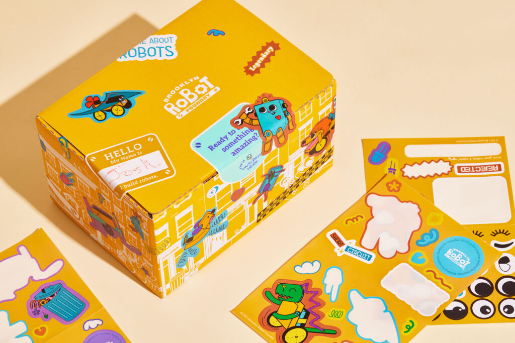
The main box isn’t just reusable, but interactive, and is part of BRF’s online classes. It has designated spots for kids and BRF staff to put stickers, indicating which robots the kits are for, along with room for play and individuality.
The top of the box also has pre-cut holes to fold and create a tablet or phone holder. When combined with an adjustable shoelace, this creates a hands-free camera holder for teachers to see what students are working on.
“We didn’t want the kids to just throw the box away,” said Paul Des Marais, Creative Strategist at Zenpack who worked on the project. “The details allow kids to interact with the box before their class, and then utilize it during the class.”
There’s three boxes to the packaging: the main one with illustrations and story. Then there’s two inner boxes, one for a glue gun, which doubles as a holder that students can set up before classes, and one for a mug. Everything needed to build a BRF robot is included in the main box.
The packaging is made from corrugated cardboard, a single screw—which helps students get in the DIY mindset—and the shoelace.
In all, Zenpack and BRF together created a complete rebrand, with new logos, colors, fonts, copywriting, brand identity, illustrations, cartoon robot-bouncing website, advertisements, collateral, and email marketing.
This clever packaging design won Pentawards and iF Design Awards.
Cambio Roasters
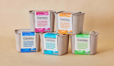
Cambio Roasters tagline is “eco-friendly, people-powered, profit-sharing, coffee pods.” So after they finished redesigning their coffee pod to simplify the material, the next step was approaching Zenpack to create easy, sustainable packaging.
Zenpack was set on using molded pulp. Pairing compostable packaging with a compostable product—coffee grounds—just made sense.
Molded pulp is simply paper fiber and water, so the team structurally engineered ribs to make it strong for stacking. They also conducted fitment tests to determine wall thickness and keep lids tight during shipping. A glue free belly band holds the lid on, and customers open it with a tear strip.
The band is also how Cambio uses to distinguish between roasts. The container itself is unmarked, so any container can be used for any type of roast, with the appropriate band slid on at the end.
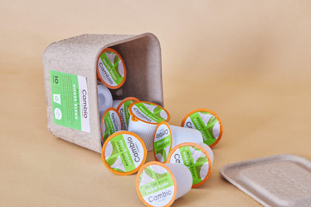
The container holds up to ten pods and is reusable, recyclable, and compostable. Customers can use it for other purposes after the pods are gone, use it to collect empty pods and then drop the whole thing in the recycling bin, or put the container, along with the spent coffee grounds, in a compost collection bin or home compost pile.
The container can even be used as a seed starter, planting seeds in early spring indoors and burying the container along with sproutlings outdoors as the weather warms. This unique packaging design fits the product and brand ethos. It functions and degrades exactly as you’d hope for a company promoting “eco-friendly.”
Aura
“When we went to dispensaries, all we saw was products geared towards men. Alpha smokers. The bro. And what we wanted was something that was missing. No one was catering to the female demographics. And that’s when, Zenpack, we reached out to them, and said this is our vision, how can we execute on this?” —Viral Hazari, Co-founder of Aura, on episode 3, season 2, America by Design, CBS.
Cannabis products are often adorned with cartoonish illustrations, graffiti-style graphics, and high contrast colors. Or they look clinical. For a long time, there was no in-between, and the female smokers were either forgotten or left out.
As Viral Hazari stated, Aura wanted something different. So they enlisted Zenpack and sister studio Haptik (branding) to design their packaging. After seeing nothing on the market that could serve as a model, Zenpack found inspiration in cosmetics.
“What we wanted to do was create a portable and lovely package that people can put in their purse or their backpack,” said Jin Wang, Lead Visual Designer at Zenpack.
The team designed and branded a new look for Aura, creating packaging from sleek, textured paper, with subtle color, deboss, and foil effect.
“This kind of slim and narrow packaging size and proportion is found to be most ideal in terms of holding in your hand,” said Leo Chao, Creative Director at Zenpack.
To create the visuals on the packaging, the team took inspiration from a puff of smoke. Zenpack calls this the Aura Cloud. “By laying different clouds on top of each other with different transparencies, we want to create that mysterious, sophisticated and yet really relaxing vibe,” said Wang.

The packaging comes in four colors, a unified palette, with each color indicating different THC percentages, flavors, and effects. All of the packaging is plastic-free, save the glass jar lids, and is reusable. Glass jars, pouches, cartons, and boxes—all of it is made from highly recyclable materials.
And the textured paper, matte finishes, and bold yet subtle colors are eye-catching in dispensaries filled with products featuring cartoon wizards riding dragons.
The pre-roll box has its own innovations, too. They’re held in a lipstick-type box that slides open on one end. The other end has a magnetic closure that opens to then unroll the box on its side, which is holding four pre-rolls. The box is also sturdy enough to be reused.
This creative packaging design won a Core77 Design Award and iF Design Award. It took home bronze at the Pentawards and was short-listed twice at the Clio Cannabis Awards. But all of that means nothing if consumers aren’t buying in, too. So what do people on the street think of this packaging?
Zenpack and Aura were featured on CBS’ America by Design, and the interviewer asked people for their thoughts on the pre-roll box.
What do you think is in it?
“Perfume.”
“Special kind of eye product.”
“Vibrator.”
“Hand sanitizer.”
“Ladies makeup—maybe lipstick.”
And as they open it to discover pre-rolled joints:
“It’s unusual, it’s sleek, it’s beautiful. Wow, I’m impressed.”
“I like how the whole thing opens up. I like the design of the box. I like the compact, non-reefer look of the box.”
“I really like the texture of this. It gives it that classy feel.”
The people have spoken—this is some cool and unique packaging design.
Flying Dog Brewery
George Stranahan opened a brewery and tavern in Woody Creek, Colorado, and very quickly, it became the “office” for one of the local residents, someone referred to as “The Good Doctor,” Hunter S. Thompson.
Thompson liked Flying Dog’s beer, and recommended that Stranahan get Ralph Steadman to do the illustrations for the branding. Steadman is the same artist who provided illustrations for Thompson’s books Fear and Loathing in Las Vegas, Fear and Loathing: On The Campaign Trail ‘72, and The Curse of Lono.
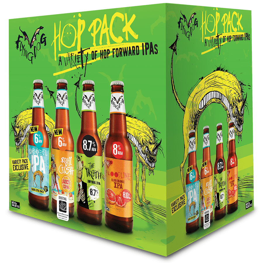
This is a niche brand, certainly: a craft brewery with regional and some national distribution. But by enlisting Steadman to do the illustrations, the brand became instantly recognizable to fans of Thompson’s work and in effect, the beer was given his stamp of approval.
Customers who had never heard of the brand saw the artwork and gave the beer a try. This is the power of branding and creativity.
So are you going to find a world-famous artist whose work is connected with a world famous writer to do the illustrations for your packaging? Probably not. But standout design elicits cool packaging ideas.
Ales Grey
There’s not really too much to say about solvents, except that they’re primarily alcohol-based and typically used for flexible plastic. They use the same types of pigments, additives, and resins as the other inks above, and only their base differs so as to adhere to different substrates.
If you buy shoes in the store, they come in a box. If you buy shoes online, they come in two boxes. So is it better to drive to the store? Not really, considering your time and gas and emissions in getting there.
Ales Grey decided to shake up footwear packaging and instead partnered with Sway, the California-based seaweed packaging company.
Sway makes seaweed plastic replacements, which are home compostable and completely fossil fuel- and plastic-free.
The packaging is simple, eye-catching, and has never been done before in footwear. This is unique packaging.

Packaging can be unique, sustainable, fun, eye-catching—it should really be all of them together. So here’s hoping you found something to feed your next project. And if you need someone to help with it, Zenpack can put a little elbow grease on it.
Be Bold and Take Chances
Packaging can be unique, sustainable, fun, eye-catching—it should really be all of them together. So here’s hoping you found something to feed your next project. And if you need someone to help with it, Zenpack can put a little elbow grease on it.
If you want to know more about Zenpack’s services
Let our packaging consultants help you turn your idea into reality.

