Cosmetic and beauty packaging designs used to be simple: trends came in, stayed hot, and eventually were replaced, with some brands riding the waves and some sticking to their roots. While that last part is still true, trends are now weekly. And while no brand can adapt that quickly—nor should they, that would be monumentally expensive and wasteful—how should beauty and cosmetic brands position themselves with their packaging design in this increasingly niche world?
This isn’t to say there aren’t trends—there are. Overarching, societal trends that encompass much of what we’ve all collectively been through in the last few years. And there are trends like sans serif fonts and block letters everywhere—although Leo Chao, Creative Director at Zenpack, argues that has more to do with smartphone usage than anything else.
So while trends are squirmy things these days, lasting for a week or a few hours if you’re a TikTok enthusiast, Chao and Jin Wang, Lead Visual Designer at Zenpack, each spent a bit of time discussing what they’ve seen lately in the cosmetic and beauty world, including packaging.
Between them, they came up with a handful of cosmetic and beauty packaging trends, background influences, and frames of mind that are affecting the whole industry today.
Back to the Cave
Collective memories linger and Chao stated that he thinks the cosmetic and beauty sectors, and especially hair and skincare products, will continue to be influenced by the pandemic for years to come—the products, the branding, and the packaging.
“I attended a conference with a lady—she used to be a principal at the Design Academy of Eindhoven in the Netherlands,” Chao said. “She does trend forecasting. One of the core messages she had is that we’re all trying to be more primitive, trying to go back to the cave, if you will. At home, we’re trying to get rid of plastic, we’re trying to get rid of anything that’s not natural. [We] want more natural materials in our home. And I think that is a core [component] of cosmetic products in general.
“It’s sort of a post traumatic response to the pandemic, to be honest. People are looking for comforting, natural, peaceful, zen-like—whatever that thing is they want to call it. But they want to feel healed at home. A retreat type of thing. And that trend will go on for many years. I think it’s the biggest trend right now.”
The biggest trend in cosmetics, beauty, and care products today is simply still recovering from the pandemic? Yeah, that seems right. But how does it help beauty brands trying to position themselves?
“It has something to do with the product as well,” Chao said. “Now the products are all about clean ingredients, natural, fewer ingredients, the most premium ones.”
Clean ingredients and a zen-like experience. Taking this simplified approach, your packaging is already taking form.
Follow the Brand
This isn’t exactly a trend, but a philosophy on branding in general, which also applies to packaging. It also might be the biggest factor in whether any of these beauty and cosmetic packaging trends even matter.
“So with any category in packaging,” Chao said, “I think the approach is to follow the brand and the message. Because this trend, or general wish of being more natural—packaging is not excluded. We’re thinking more about natural paper, paper that’s not coated, not laminated, that has an appearance of natural material, like stone paper texture or washi paper. Now of course, not all brands will fit in that category. If your brand is all scientific, the next generation, NASA uses this thing—then you should follow that. That’s universal for any project, obviously—your packaging is part of the brand.”
Following trends doesn’t work if they don’t apply to your product or brand, which are inherently linked.
Wang, the visual designer, talked about how audiences are the biggest driver for branding.
“Cosmetic packaging is strongly related to [a brand’s] marketing approach. So it’s really based on their target audience and their brand. Brand voices define style. And it can be a variety of popular styles—8’s, 70s can even be used in cosmetics now.”
I asked about her work on Aura Cannabis—although not cosmetic packaging, the brand was designed for a female audience and the joint boxes were made to mimic a lipstick box.
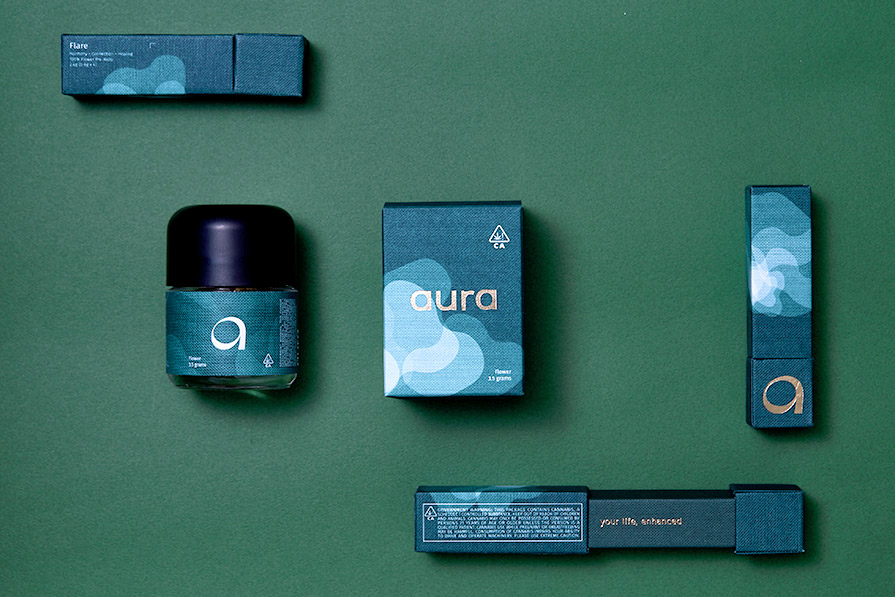
“The owner wanted to build something like lipstick packaging. That’s why we went in that direction. We created something that feels cosmetic, really female oriented. And they wanted to create that luxury feel. That’s why we choose textured paper, art paper—you see that type of paper used in many fashion brands. They like to have their patterns on the packaging so they can feel it. When we’re doing branding, we like to use our different senses. Not only visual, but also smell, feel, sense of touch. It’s a very cohesive, multi-sense approach.”
Aura was created to fill a void in the cannabis market, where there was really nothing tailored to women. This idea of branding follows exactly what Chao and Wang talked about, because it didn’t adhere to overarching trends, but instead focused on its target audience.
What Wang described, also, is another component to beauty and cosmetic packaging. Ideas around tactile experiences in packaging aren’t new, but there are so many techniques and options now to give consumers that multi-sensory approach, that it’s almost expected to be there. Is that a trend? Wang and Chao didn’t mention it, but it’s certainly a part of many brands’ experience.
But what other physical things are they looking at when designing beauty packaging for a brand? What makes it a brand, one of a kind?
“For primary packaging for cosmetics,” Wang said, “we have to do a lot of small searches. For example, when you’re using shampoo, we have to find the right pump. Just those nitty gritty things, we need to find the perfect one for our clients and we need to test it to get perfect results. And we need to decide not only on the material itself, but what kind of finishes we’ll want to add. You can add a lot of different effects by using the finishes, [such as] deboss and emboss.”
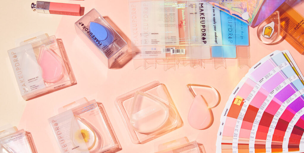
And sometimes, with a new product, you need to showcase the product itself, so customers can see what they’re buying—especially if it’s never been done before. Zenpack’s work on MakeupDrop is a perfect example of this, highlighting the silicone makeup applicator inside while still giving all the necessary information on the front of the package. And although plastic isn’t ideal, using a monomaterial package (PET plastic in this case, also the most recyclable form of plastic) increases the likelihood of recycling.
Fonts in Beauty and Cosmetic Branding
Neither Chao nor Wang really wanted to nail down visual trends with how fractious and niche brands are today. But obviously there are some things that can’t be ignored.
“If you have to say a visual style,” Wang said, “we see a lot of simple, minimal, clean styles recently, with sans serif fonts. But on the other hand, we see a lot of really decorative brands as well. Decorative strokes on their branding and logos.”
Chao also got into the fonts that have been so prevalent recently, looking at where they came from and where they’re going—not just in cosmetics and beauty, but everywhere.
“Trends in cosmetics or beauty follow closely with fashion,” he said. “Usually the fashion brands start doing something, then the cosmetic world follows. All the fashion brands, for the past five years—probably because of Apple or something—like every fashion label has thrown out their fancy serif [font] and gone to Helvetica or something very simple, very straight, very modern.
“For the past year or two, there has been a surge of ditching that and going back to the root of more decorative—however you want to call that—but basically more organic and less, you know, that Apple look.
“Burberry is a good example,” he said. “Five years [ago] they switched to Helvetica. Very bold, very solid, perfectly fine for social media. And last year they switched it back to their old fancy handwriting font. Why? People got tired of seeing the same thing.
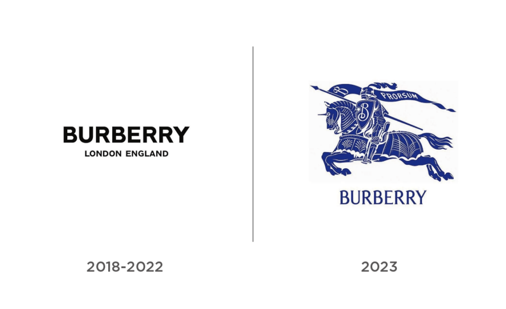
So why are we suddenly seeing this font everywhere, or similar types?
“I believe [it’s because of] social media—no joke—because you can’t see all the details, the aesthetics are so fine. Your phone is too small. But then every brand started to look the same.
“So aside from the natural ones, I think brands are going back to more serif, more organic, more decorative things. I don’t know how long it’ll last, because the bar is moving rapidly between more modern and more art deco types.
All of this to say, if there’s a font that fits your brand and your target audience, use it. Because trying to keep track of how fast things are moving just seems like a losing game. And if you’re wondering how much of a losing game? Just look at the responses to Eddie Bauer and Johnson & Johnson’s recent logo changes. In a quest to stand out, everyone is looking awfully similar.
Trends in Beauty and Cosmetics
So if fonts on beauty and cosmetic packaging are see-sawing between bold minimalism and high artistic decoration, what are the graphics up to these days?
“Visually, it’s just very different,” Wang said.
How different?
“Some brands are still very attached to that modern look,” Chao said, “and some brands, especially newer brands, are trying to be so different. Quiet luxury pattern, decorative, but subtle. Or you’re seeing a surge of super crazy graffiti type things, just crazy stuff.
“There are some new brands,” he said, “which are doing drastic, eye-catching—beautiful as well—but in-your-face type of things. Contrast, high colors. Almost going back to the 80’s or 90’s.
“The graphics thing that’s going on, I believe they’re micro trends, responding to something: ‘you’re boring, you’re fancy, you’re crazy, you’re 90s, you’re millennial, I’m gonna do something else.’ They’re all just conversations flowing back and forth.
“What I think is more stable is that natural [look],” he said. “That’s the safe bet and what everybody is kind of going to.”
So do you want natural or graffiti or modern, Prairie Home Companion or Suicide Squad or Downton Abbey? Take your pick. It just depends on how you want to position your product. Speaking of positioning…
Luxuriousness in Beauty and Cosmetic Packaging
Cosmetics, beauty, care products—they’re all about luxury these days. People want to feel luxurious when they’re using them—which also goes along with Chao’s first thoughts about wanting a zen-like experience at home.
But what is luxury, especially when it comes to packaging?
“There’s a few key words when you talk about luxury,” Chao said. “Privacy. Exclusiveness. Rarity. Only I get to use this.
“But how do you do that? As a brand you want everyone to use your product. But when everyone uses it, you lose that thing that makes it special…I think the true luxury brands exclude. They do a lot of work to stop people from buying the product. If you feel like you have a hard time getting the product, it probably means it’s a true luxury brand.”
This doesn’t mean people need to take horseback to Winnipeg to get your product, nor do you necessarily want people to have a difficult time getting your product. Again, it depends on your positioning. If a product has clean ingredients, if it makes people feel good when they’re using it, does it matter if it’s exclusive?
So how about the packaging?
“Luxury packaging itself is meaningless,” Chao said. “People don’t say ‘I want luxury packaging.’ No, luxury packaging lives attached to luxury products. That’s what it is. You can design packaging to be luxurious, you can make the product appear more luxurious. But that, by definition, is not luxury packaging because the product is not luxury.
“You can make the packaging more premium—there’s always a way to do that,” he said. “Choosing different materials, designing the form differently. But does that actually make the product luxury? I don’t think so. It doesn’t change the product’s positioning.
“People always ask, ‘Can I make it more luxurious, can I make it more premium?’ Sure. ‘Can I pay less though?’ All those unique things [like a ribbon exclusively from a small region], they cost more. There’s no way around it. Sometimes we can find ways to make it more premium—maybe by structural engineering—that costs less, but that only takes you so far.”
Same question, Jin. What makes luxury packaging?
“Yeah, so the first thing is budget,” she said, laughing. “What type of paper you use—there’s a price difference. Texture, print quality, finishes, films. Water transfer printing on glass. There’s a lot of ways to create a very exciting look. It all depends on your budget.
“On the other side,” she said, “some luxury brands are really simple. They might just have branding on top of their box and that’s it. But they actually do a lot of behind-the-scenes things. For example, with Crown Affair, we spent a lot of time working on color consistency. The green color has to look the same across different materials. That’s important. Inconsistent color will give an unprofessional look. And it’s very common, actually, because different substrates tolerate inks in different ways. That’s why there’s different colors. Some factories are printing CMYK, others Pantone, and it will create a different look. So brand consistency is important to defining a luxury brand.
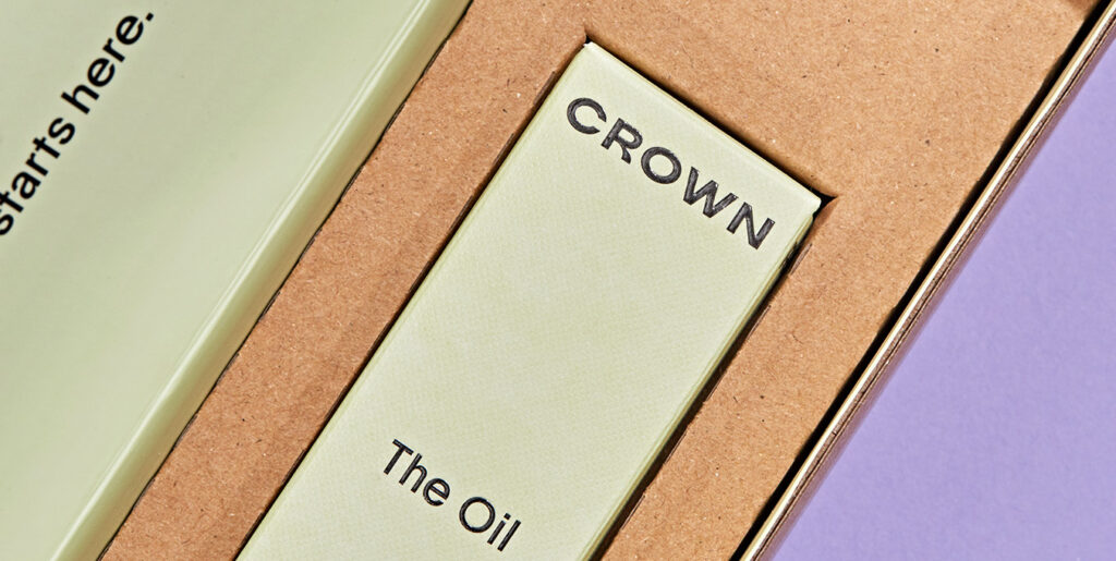
“And there’s materials and brand recognition. When I talk about brand recognition, it’s like you’re creating a routine of how you show your brand. That’s why those luxury brands spend millions on their branding, defining where to put their logos in a consistent way. So those nitty gritty things really define how you build a brand. You need a lot of patience and focus to run and trial those things, to define a luxury brand.”
So budget is the main driver for luxury packaging. But again, that doesn’t mean that the feeling of luxuriousness can’t be conveyed. Good designers can help a brand position itself and deliver an exceptional unboxing experience. And if the product works, that does more than anything else.
Sustainability in Cosmetic and Beauty Packaging
Back to where this piece started, natural, comforting, getting back to our roots. Besides the pandemic, both Chao and Wang say this is the biggest trend in packaging today, and not just for cosmetics, beauty, and care products.
“Overall for packaging,” Wang said, “many clients are asking, ‘Can I have more sustainability in our packaging?’ It’s a big trend. And in the US they always want to be more involved in those topics—it’s a very good marketing piece as well.”
It is a good marketing piece, and how are brands taking advantage of it?
One of the biggest trends in beauty, cosmetics, and care products today is subscription services with reusable and refillable packaging.
“Mark my words,” Chao said, “a lot of brands will be moving to that. And they’re gonna say ‘We’re super sustainable because we’re doing this permanent packaging and refill pack. We’re sustainable. We’re green.’”
“What’s driving that,” he said, “is actually the subscription mindset.”
If people buy a permanent piece of packaging to start with, Chao says, they will likely buy at least a few refills. This makes the quest for sustainability also a financial incentive, as permanent packaging encourages loyalty. And refill packs are generally less expensive to produce and ship. Plus consumers value sustainability.
“There’s a company,” Chao said, “who designed a cleaning bottle—a permanent spray bottle. The bottle is so well-designed, I kind of don’t care what’s inside. I don’t mind buying the solutions. It’s not that different. Just some spray I clean my desk with, a scent I love. But the bottle is so well-designed, aluminum, a perfect thing in my home, looks great on my table and all that—I keep buying from them.
“That will be the next thing because it is truly a little more sustainable,” he said, “and skin care or cosmetics will be the first to adapt. What I’m glad about is that—I don’t see how some people will greenwash the hell out of it. At its core this is better than single use so if people might not have the right intentions, the result might be good anyways.
Many refill models that have come out recently are using aluminum. Is that what Chao is thinking too?
“About three months ago, I was talking to our China team and said: ‘Go out and find aluminum packaging suppliers, it doesn’t matter what they make, as long as they’re pure aluminum. I want to know, because it’s coming.’
“We’re looking at suppliers that can do aluminum, we’re looking at printed finishes on aluminum, because it’s not that easy. A lot of these printings are actually just film wrap and people don’t really separate them. So we’re looking at how do you mark aluminum material without adding any more film?”
While aluminum, paper, and other nonplastic materials are hot topics right now—as they should be—Wang discussed how they’re only half the battle in reducing our impact on the planet.
“Half of sustainability is the materials—sustainable materials are really important—but half is the strategy as well. Like refill packs—that’s another way to be sustainable.”
So sustainability in cosmetic and beauty packaging, right now, is coming down to reuse and refill containers, aluminum and other nonplastic materials—where possible, and good design.
Rounding It All Up
While it’s simple to just say natural brands are in, or you should just copy Apple, beauty and cosmetic packaging is more complicated than that. Niche brands are flourishing because their target audiences feel seen. Just look at Ffern, which makes extremely small quantities of perfume every three months.
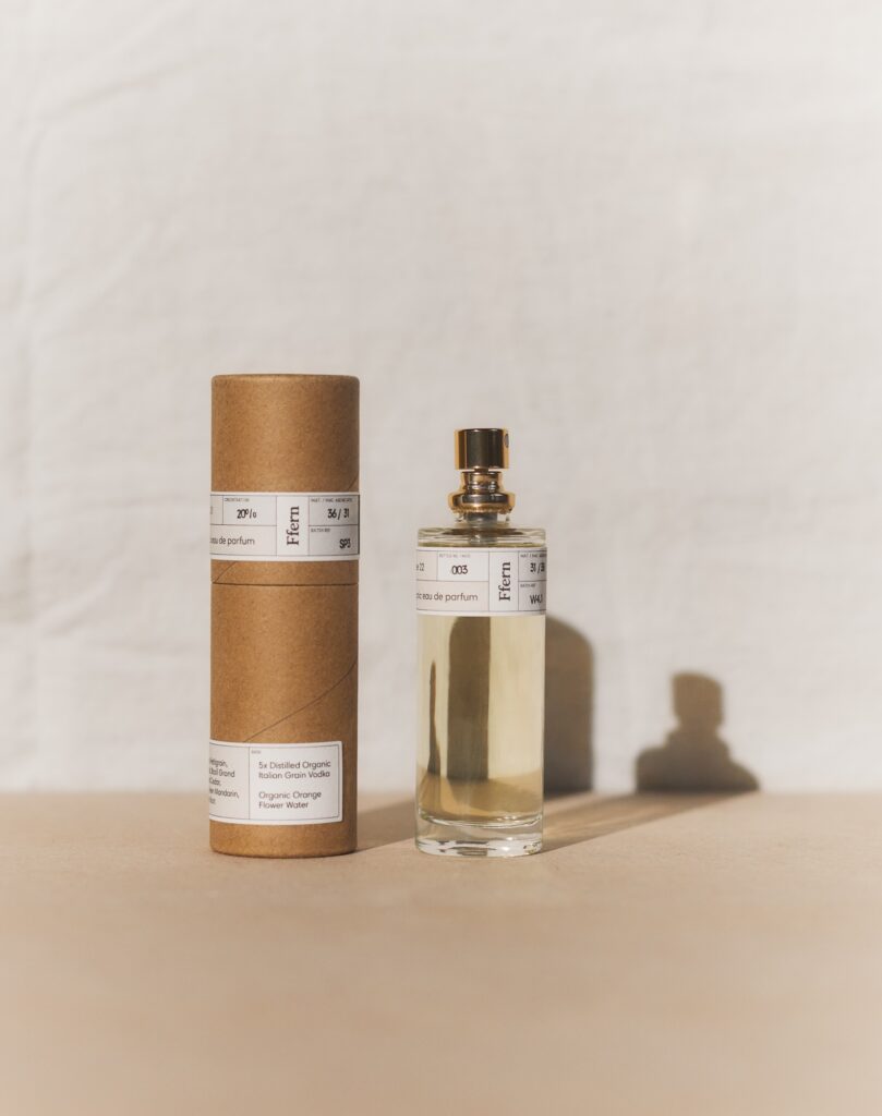
But these are the cosmetic, beauty, and care product packaging trends the Zenpack team has noticed in 2023, and that should continue into 2024 and beyond.
- Back to the Cave: Beauty, cosmetic, and care products are a response to the pandemic
- Follow the Brand
- Fonts: minimalist or decorative
- Graphics: natural, graffiti, modern, or elegant
- Luxury
- Sustainability, reuse and refill, materials, thoughtful design
So if you want considerate designers, ones who take trends into account—including the latest in influencer packaging—and then throw them out the window so that your brand can flourish, ones who are always learning about better design and materials to lower their and your impact, talk to Zenpack. Seems like it might be a good idea.
If you want to know more about Zenpack’s services
Let our packaging consultants help you turn your idea into reality.

